Pink Commerce brand book
One family standard, expressed in a mark, a palette and a voice. This page is the living reference for every venture surface.
The mark
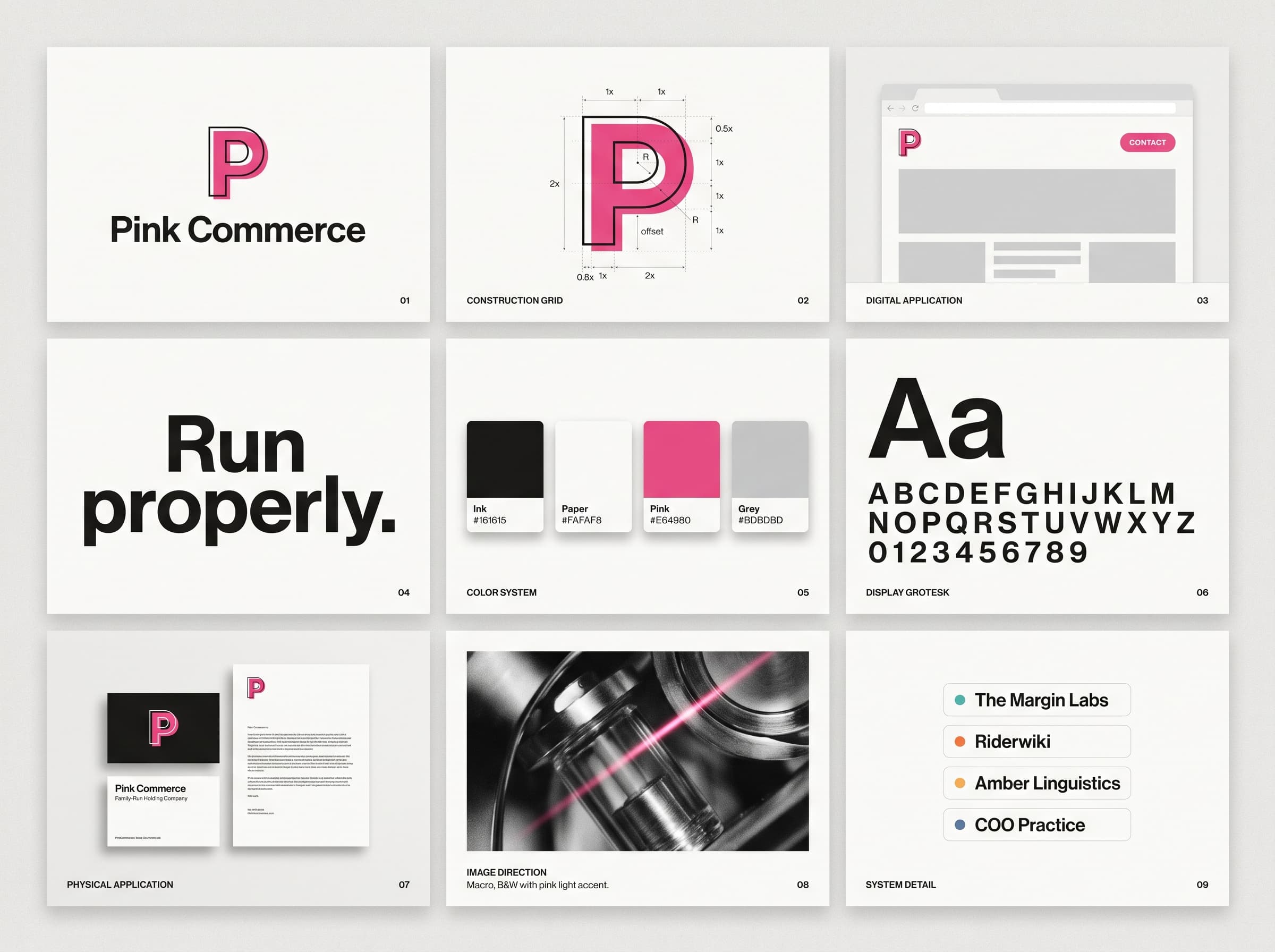
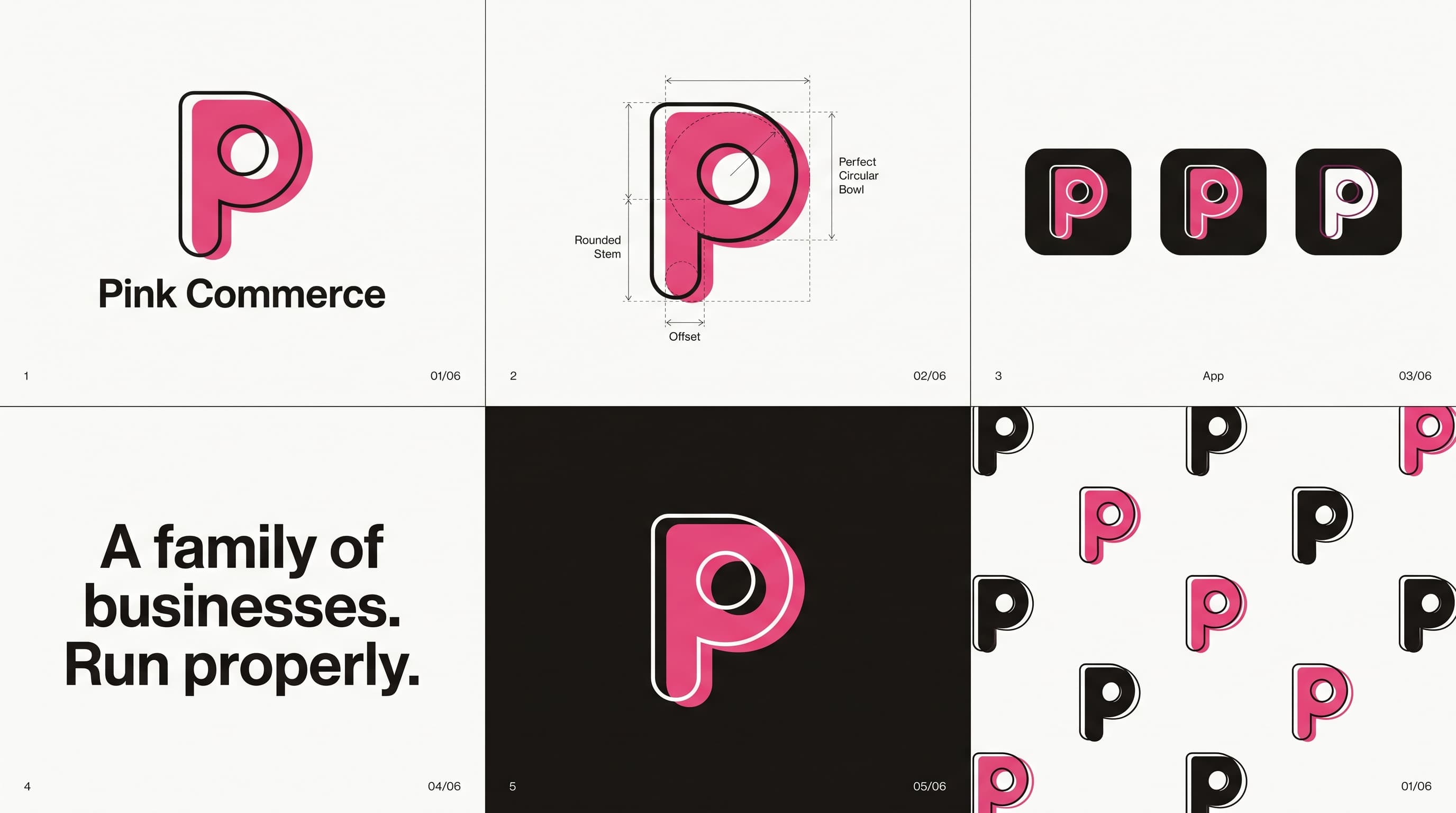
A solid pink P and its outline echo, offset like a double exposure: the ventures in front, the family standard behind them. One motif everywhere, from the favicon to the brand film, always the same geometry, always one echo.
Color
Pure monochrome plus one saturated pink. The pink is the family signature and appears exactly once per composition. Venture accents exist, but they live inside their own venture surfaces and never mix with each other.
Ink
#161615
Paper
#FAFAF8
Pink
#E64980
Deep pink
#C2255C
TML teal
#0F5257
Riderwiki orange
#E8590C
Amber
#E8A33D
COO slate
#3B4754
Type
Display, Bricolage Grotesque
Run properly.
Body, Geist
Short sentences. Concrete numbers. If a line would need translating into plain English, we rewrite the line.
Labels, Geist Mono
The portfolio
Voice
Plain dealing, warm and unshockable. We publish prices, name the humans accountable, and say how the AI is used.
Say
“We run four businesses. Properly.”
Never
“A synergistic portfolio of innovative, best-in-class solutions.”
Say
“AI drafts. A named human signs.”
Never
“We leverage cutting-edge AI to deliver transformative outcomes.”
Motion
The brand film: the layered P drifting in space, rendered with Remotion and finished with ffmpeg. On the homepage the same composition runs live and follows the pointer and the scroll.
System